It’s frustrating when after all your efforts to attract potential customers to your online store and offer them high-quality products, they simply leave without completing a purchase in the e-commerce checkout stage.
However, it’s nothing unusual since the average shopping cart abandonment rate is almost 70%. This is an underwhelming statistic, but if we inspect the reasons behind it, the conclusion is pretty comforting – you can control and improve your shopping cart and conversion rates by applying some e-commerce checkout best practices.
So, how do you optimize the checkout?
Why Do Customers Abandon Shopping Carts?
Before we discuss how an effective e-commerce checkout flow should look like, it’s important to address the main issue and understand why people abandon shopping carts.
First of all, some of your e-commerce website visitors are simply window shopping and they’re not ready to purchase yet, and we’re not going to focus on them at this time point.
But, unlike those who just want to browse with no intention of purchasing, there are people who have come to purchase but changed their minds when they reached the checkout.
Some of the most common culprits behind checkout abandonments according to Baymard Institute include hidden extra costs, creating an account, too long and complicated checkout process, trust issues, lack of payment methods, and buggy website.
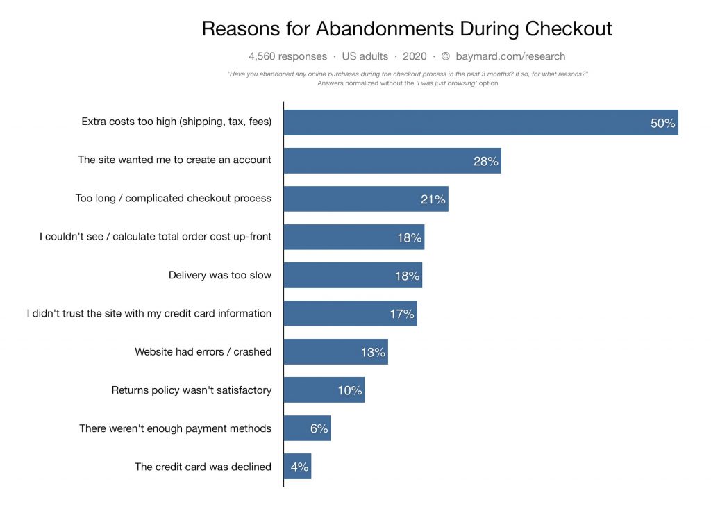
As you can see, you can easily prevent almost all of these situations by fixing your e-commerce checkout flow, and you don’t have to be an expert to do that.
1. Keep It Short and Simple
The thing is that people don’t want to click endlessly through a maze of different fields and requirements during the checkout process.
They want to pay as quickly as possible and receive a confirmation that their shipment is on the way. Think about it this way – the longer your checkout process is, the more time your customer has to change their mind and abandon the shopping cart.
Simplify your forms and ask only for the necessary information, and don’t make them type the same details more than once. For example, if their shipping and billing addresses are the same, they will be automatically displayed in both fields by default. If a user needs to change their address, they could click a button to add another one.
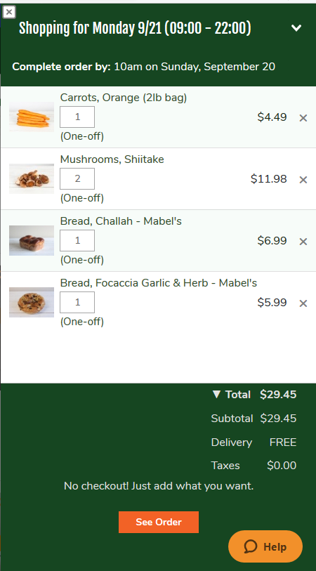
Fresh City Farms sets an example with its simplified checkout process. The store asks for payment information only once, and customers can add products in the cart and expect delivery.
The checkout benchmark for the top-grossing US e-commerce stores shows that their average checkout process flow for a new customer is 5 steps long. Amazon used to have a multiple-step checkout but based on customer feedback, the company reduced it to only one step for those who ordered before.
Here are the major takeaways:
- Require only essential information, and make sure that the first thing you ask for is your customer’s email address. That way you’ll be able to reach out to them if they don’t complete their purchase, as well as target them with your promotions.
- Implement the prefill option. Changing the shipping and billing addresses should be an option and not a requirement.
- Don’t collect useless information just in case, especially not during the checkout process. You can always ask your customers, later on, should you need anything else.
Remove Friction With a Self-Contained E-Commerce Checkout Process
When your customer puts items in their shopping cart and initiates the checkout process, the worst thing you can do is distract them.
Let them zero in on completing the purchase with a self-contained checkout process.
This means that you should avoid any ads, pop-ups, and any other unnecessary information that would divert your customers’ attention to something other than finalizing the purchase.
A way to achieve this and prevent your revenue from slipping through the cracks of an imperfectly designed checkout process is by simplifying your header by removing the Menu tab from it.
Another good idea is fitting your entire checkout process into a single page so that your customers can enter all the necessary information in one place. A good example of this is Adidas:
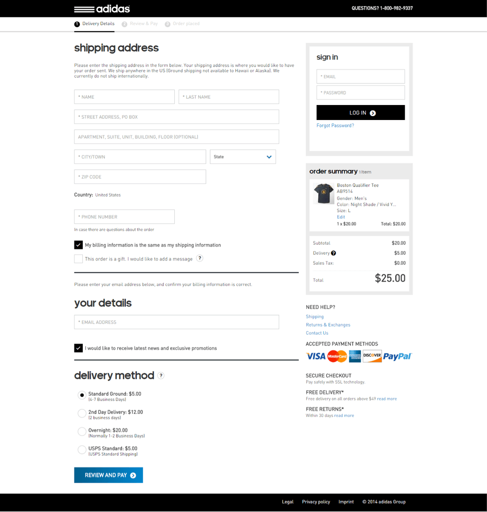
While it’s essential not to let your customers click their way to another page during the checkout, it is even more crucial to make sure that all the help and relevant information they need is within their reach. This means implementing live chat, listing emails/contact forms/phone numbers they can use, and providing various delivery options, as well as the information about business hours and delivery estimates.
Enable Guest Checkout
The survey above states that 28% of people abandon their shopping cart if the site requires them to create an account.
Enabling guest checkout is among the most important e-commerce checkout best practices, as it speeds up the entire process and ensures a smoother experience.
You can still offer your customers to register, but after they have completed their purchase. This way, you won’t disrupt the e-commerce checkout flow – your customers will have an opportunity to get a feel of your service before they decide whether they want to trust you with their personal details.
Crate&Barrel allows customers to choose whether they will register or complete their purchase as guests:
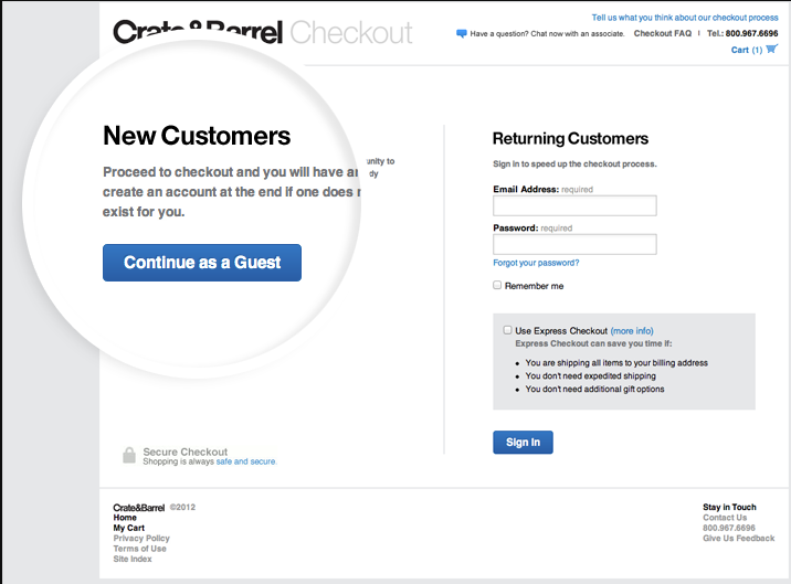
The bottom line is that you shouldn’t force your customers to register, but it’s perfectly OK if you encourage or even incentivize them to do so.
Walmart, for example, provides a guest checkout option, but right below it, there’s a disclaimer saying that those who want to use a promo code need to create an account.
4. Provide Multiple Payment Methods
Payment is a critical step in your entire checkout process.
That’s the moment when your customers are willing to give you their money, and getting this step right makes a difference between making a profit and losing a business opportunity.
So, how to increase e-commerce checkout conversions?
It’s simple – by providing multiple payment methods.
For example, there are 346 million active PayPal accounts in the world, while 82% of consumers on the American continents prefer to use their credit and debit cards for online shopping.
We shouldn’t forget gift cards, prepaid cards, Apple Wallet, Google Wallet, Visa Checkout, Masterpass, Alipay, and a number of other available payment solutions shown in the following statistic of most popular online payment methods by regions:
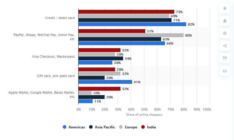
It’s good to know what your target audience prefers, but it’s even better to play it safe and offer as many payment options as possible.
If you don’t allow your customers to pay with a card that, for example, gives them reward points, they might opt for your competitors. It’s as simple as that.
Don’t shrug off less traditional and conventional payment methods such as Payoneer, PayPal, or Apple Pay, because a growing number of people find these much more convenient.
Finally, sometimes credit cards get declined, and if you have multiple payment options on your checkout page, your customers can choose another one and complete their transaction.
5. Be Transparent About Charges
Nobody likes unpleasant surprises, and your customers will be disappointed and annoyed if they find out that there are some hidden costs and fees that weren’t shown upfront.
Not only will such a tactic lead to higher shopping cart abandonment rates but it can seriously affect customer trust.
That’s why you should be open with your customers and list all the fees they should count on, including shipping costs, sales taxes, and gift-wrapping charges, when they reach the checkout page.
Take a cue from Disney, as the company allows its customers to pick various delivery dates and control their shipping costs.
Remember that you can trick people only once by hiding your fees and charges, but they will punish you by never ordering from you again.
6. Implement a Progress Bar
Customers get frustrated if they don’t know where they are in the checkout process and how many more steps are there.
By incorporating a progress bar, you’ll prevent them from growing tired and abandoning their shopping cart. Besides, this visual element streamlines and clarifies the purchase process flow, and helps your customers understand how long it takes before they’re done.
This element is particularly important if you have a multiple-step checkout process that tends to confuse people – with a progress bar, they will always know at what point they are.
Another thing to bear in mind here is allowing your customers to review or change any of the steps without having to enter their information all over again. This can be quite an issue when it comes to user experience and can affect your shopping cart abandonment rates.
7. Display Trust Signals Throughout Your Checkout Process
Don’t forget that your customers will have to share their sensitive information with you, including their credit card numbers, so it’s only logical that they expect the utmost level of e-commerce security.
That’s why displaying trust signals should be on your priority list when it comes to e-commerce checkout best practices.
There are various ways to convince your customers that they can trust you with their personal information without worrying.
Here’s what you can implement:
- Merchant reviews. These show how satisfied your existing customers are with your e-commerce store.
- SSL certificates. This green padlock in the address bar indicates that your website is trusted and secure.
- Third-party security validation shows that your online store is protected by, for example, Norton, McAfee, or similar cyber-security software.
- Logos of available trustworthy payment options, as well as Visa Certification.
All this can have a strong psychological effect on your customers and eliminate their potential trust issues.
8. Add the Option to Continue Shopping From the Checkout Page
Sometimes people forget to add an item to their shopping cart, and there’s nothing more annoying when the back button undoes previously taken actions so that they do everything all over again.

The odds are that unhappy customers will simply churn and pick an online store with a better designed and optimized checkout process.
By implementing the option to continue shopping from the checkout, you will allow your customers to make adjustments to their shopping cart, that is, to easily add or remove items without any friction.
Just make sure to differentiate between the checkout and continue shopping buttons so that people don’t accidentally click on the wrong one. It’s a good idea to use different colors.
Another similar option that can increase your conversion rate is the “save to cart” button. When your customers can save individual items or the entire cart, it’s more likely that they will return and complete the purchase later.
9. Provide Necessary Product Details
In order to prevent returns, it’s important to provide all the necessary product details, so that your customers can be sure that they’re happy with it.
Here’s what will improve your checkout process and the likelihood that customers will finalize their purchase:
- Include a product description. The name and the number aren’t enough, because people want to make sure they have picked the right item before making a purchase.
- Provide the order number, so that customers can check with your customer support if they have any additional questions.
- Include in stock/out of stock information. It’s frustrating when someone goes through the entire checkout process only to find out that the item they want is out of stock.
- Let your customers know when the item they preordered will be delivered. This will increase the odds that they will finalize the purchase.
- Show social proof and customer reviews. People often experience buyer’s remorse, which is why it’s crucial to show them how happy other customers are with the products they purchased. While there’s no need to place reviews on your checkout page, they are crucial for boosting your customers’ trust in your brand and convincing them they’re making the right decision. If we bear in mind that 84% of people trust online reviews as much as their friends’ opinion, it’s clear why you should have customer reviews and customer testimonials on your product pages and other sections of your e-commerce website leading up to the checkout process. Some of the effective tactics for getting more customer reviews include asking your existing customers for feedback or even incentivizing them to put in a good word for you.
- Have a return policy in place. It’s almost certain that a certain number of items will be returned, so you’d better be prepared to deal with this smoothly. Your customers need to know all the conditions and requirements related to returning purchased items before they complete the process.
These simple details can significantly improve your checkout process flow and increase your conversions.
10. Streamline Your Website Performance
Last but not least, if your e-commerce website performance leaves much to be desired, you can count on a lot of unhappy customers.
Given that 51% of global internet traffic comes from mobile devices, your e-commerce website should be mobile responsive. This means that your checkout process should work on mobile devices as seamlessly as on desktop and notebook computers. In other words, don’t make your customers pinch and zoom in order to enter their information or click buttons.

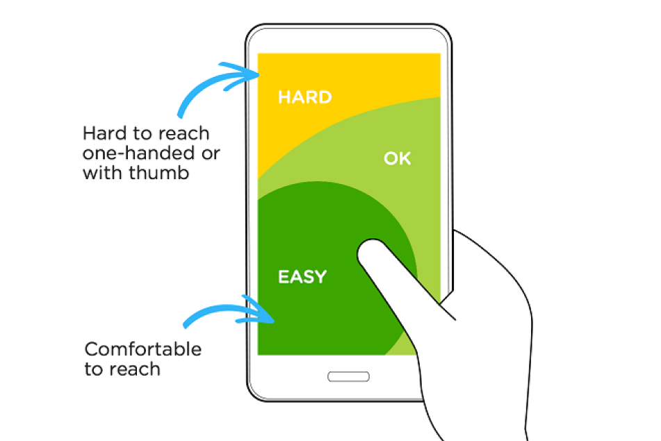
For example, design your entire website and checkout page for touch and not for the mouse. This means that your website should be designed so that it allows for comfortable navigating it using their thumbs. As 49% of people interact with their mobile devices by holding it in one hand, your design is supposed to take the thumb zone heat map into consideration, which means that you should place crucial elements of your checkout process so that they are within the reach of the thumb.
Another important point is that you should optimize your website load speed, especially for its mobile version. People don’t want to wait in lines, and the same can be applied to e-commerce.
Stats say that just a 1-second delay in mobile times can increase conversion rates by 20%. This is an important factor to bear in mind when you’re thinking about effective e-commerce website design.
In order to speed up the checkout process, you can:
- Eliminate any graphic-intensive elements, such as carousels or any visuals that could increase load times
- Remove social media and other third-party scripts that are not necessary on the checkout page
- Your logo and other necessary icons should be hosted on a content delivery network.
All this can have a tremendous impact on your user experience, and subsequently on your conversion rates and bottom line, which is why streamlining your website performance is among critical e-commerce checkout best practices.
A streamlined checkout process is a must when it comes to improving user experience, increasing revenue, and preventing abandoned shopping carts. This means that you can’t afford to make a mistake when designing this portion of your e-commerce website. By implementing the tips we discussed, you’ll be able to make the most of this short window of opportunity to convince your customers that clicking on the “Buy” button is the right thing to do.